About the forecasts
How are coups measured?
We use the Powell and Thyne lists of coups. For more details and the original coups data see https://www.jonathanmpowell.com/coup-detat-dataset.html.
How are the forecasts generated?
The forecasts are created using random forest models that use data from 1960 to 2018 to identify patterns predicting past coups and then 2019 data is used to project 2020 risk estimates.
For more details, the data and code used to generate the forecasts are on GitHub at https://github.com/andybega/forecaster2.
Data
We use several data sources for potential coup predictors:
REIGN - The Rulers, Elections, and Irregular Governance dataset, https://oefresearch.org/datasets/reign
EPR - Ethnic Power Relations dataset, https://icr.ethz.ch/data/epr/
V-Dem - Varieties of Democracy data project, https://www.v-dem.net/en/
WDI - the World Bank’s World Development Indicators, and specifically infant mortality, cell phones per capita, and internet users percent; https://databank.worldbank.org/source/world-development-indicators
More details are available at the project GitHub repo at https://github.com/andybega/forecaster2.
Accuracy
Although the 2020 forecasts are created using models that use data through 2019, we also conduct test forecasts for 2010 to 2019. Since we already know what the record of coups was for this period, we can calculate fit measures. The table below shows the areas under the ROC (AUC-ROC) and precision-recall (AUC-PR) curves. The ROC and PR curves quantify, in slightly different ways, the tradeoff between true and false predictions a model makes. Ideal models will have values near 1, meaning that that tradeoff is minimal and the model can identify likely instances of coup (attempts) with very few false positives.
For the AUC-ROC measure, the basic skill threshold to beat is 0.5. Any model below this value is worse, on average, than a random forecast. For the AUC-PR measure, the skill threshold is equal to the positive rate in the data. This is shown in the “Pos. Rate” column.
| Outcome | Cases | Pos. Rate | AUC-ROC | AUC-PR |
|---|---|---|---|---|
| Any coup attempt | 18 | 0.012 | 0.810 | 0.047 |
| Successful coup | 10 | 0.007 | 0.781 | 0.043 |
| Failed coup attempt | 9 | 0.006 | 0.800 | 0.021 |
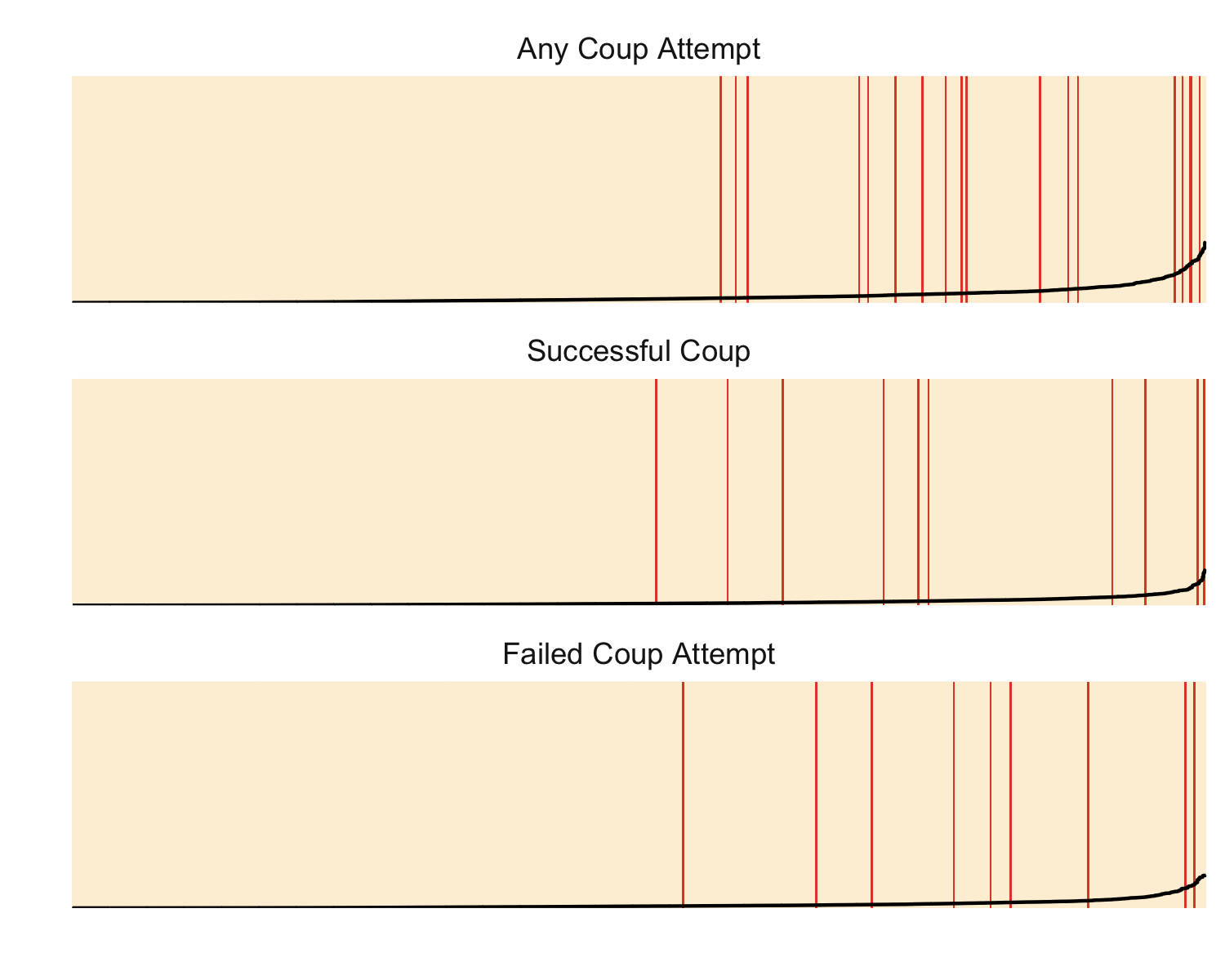
Another way to visualize performance is with separation plots. These arrange all predictions by their predicted probability, which is shown by the black line, and then mark cases in which an event actually occurred with a red line. In an ideal model, the red lines, which correspond to coup attempts, etc., will be all the way on the right and the black line would be near 0 for the sand-colored area and near 1 for the red colored area of the plot.
The y-axis is on the probability scale and ranges from 0 to 1. The x-axis corresponds to all country-year cases in the test forecasts. Within each plot, they are sorted by the predicted risk for that outcome. Note that as a result, the order of cases within each plot does not match that in the other plots.
Citation
If you would like to refer to our forecasts in academic work, we would appreciate it if you cite:
Andreas Beger and Michael D. Ward, 2020, “Coup forecasts for 2020”, https://www.predictiveheuristics.com/forecasts.
License
The forecasts are licensed under the Creative Commons Attribution 4.0 International license (CC BY 4.0). The underlying code and data transformations are licensed under the MIT license.